Blog / Marketing
Pest Control Logos and Branding: What Works, With Examples

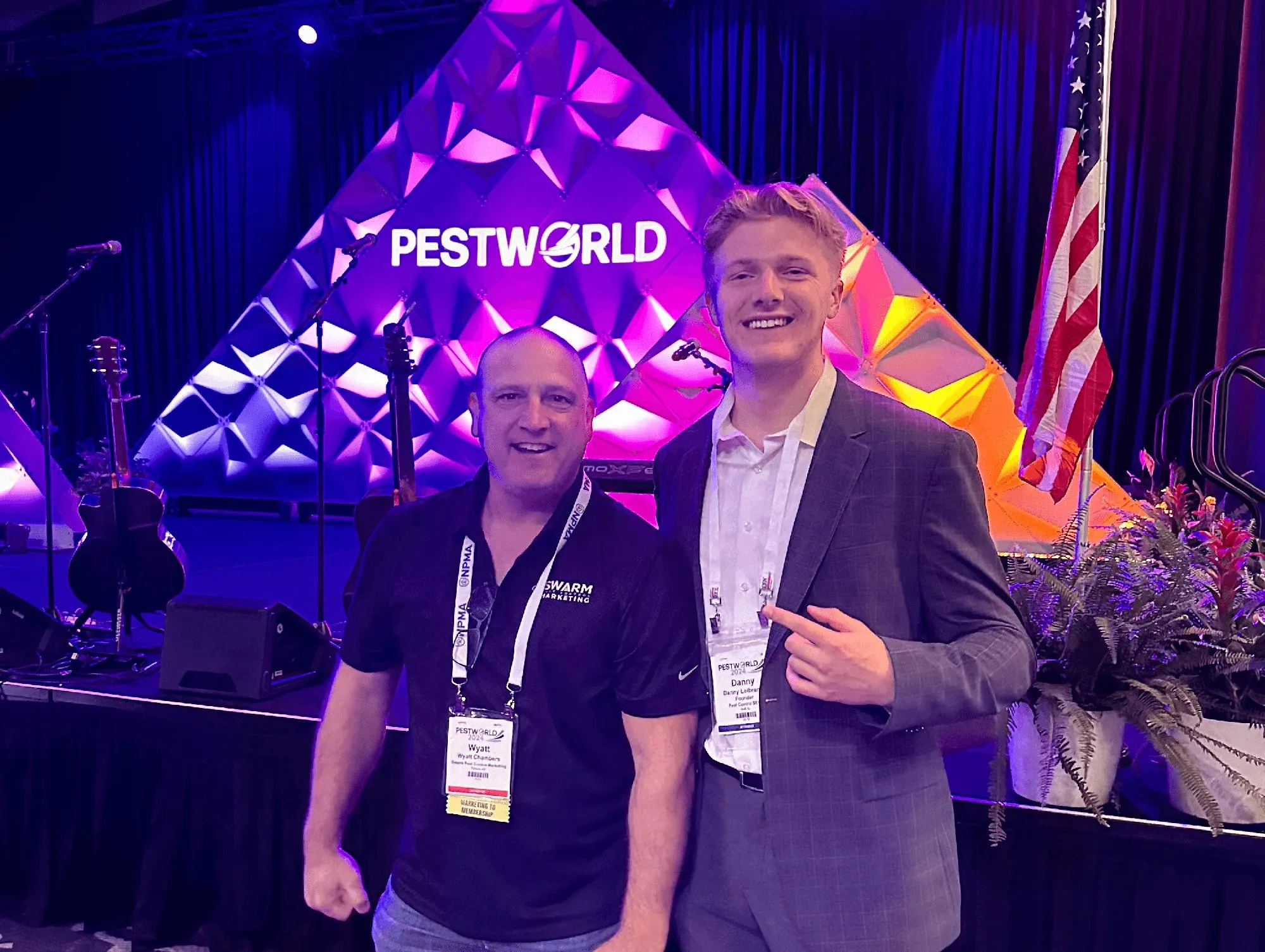
A good pest control logo can be read in a second or two: on a truck passing at highway speed, on a yard sign from the street and as a small square on your Google Business Profile. That usually means a short name in a heavy, plain font, one or two strong colors and, at most, one simple icon.
Your logo is the piece of pest control branding that ends up on everything, so settle it before you wrap a truck or order shirts. The four example logos below belong to companies I made up. Choosing the name comes first, and I cover it in pest control business names.
What a pest control logo has to do
Most of the time, nobody looks straight at your logo. They catch it from the next lane or as a thumbnail in Google Maps, so design it for those moments, not for the big version on your designer’s screen.
| Where it shows up | How people see it | What it needs |
|---|---|---|
| Truck wrap | A few seconds, from a moving car | A big, readable name and strong contrast |
| Yard sign | From the street | Few words and thick letters |
| Google Business Profile | A small square beside your name | A square version that works small |
| Favicon in search results | A tiny square next to your site | An icon or letter that reads tiny |
| Shirts and hats | Embroidered a few inches wide | Few colors and no thin lines |
| Door hangers and invoices | Up close, in someone’s hand | A small logo that lets the message lead |
Google’s specs show how small some of these get. Business Profile photos, your logo included, should be JPG or PNG, and Google recommends 720 by 720 pixels, so you need a square version. For search results, Google asks for a square favicon that represents your brand, larger than 48 by 48 pixels.
One quick test catches most problems. Shrink the logo to the size of your thumbnail on a phone screen, print it in black only and look at it from across a parking lot. If the name gets lost in any of those, it’ll get lost on the truck too.
Pest control logo ideas: four styles, with examples
Almost every pest control logo falls into one of four styles. Pick the one that fits your name and holds up in the places above.
| Style | Best at | Weak spot |
|---|---|---|
| Wordmark | Reading from a distance | Needs a distinctive name |
| Icon plus wordmark | Working at every size | The icon can easily end up generic |
| Badge or emblem | Shirts, hats and an established look | Small, curved text |
| Mascot | Being remembered | Hardest to draw well |
Wordmark
A wordmark is just the name in a strong font. It’s the cleanest option and usually the easiest to read on a truck, as long as the name is short. Five or six words get tiny fast.
For the square spots, like your Business Profile and favicon, use the first letter or stack the name on two lines.
Icon plus wordmark
This is the most common setup, a simple symbol next to the name. The icon can stand alone as your profile photo, favicon and hat logo. In the Northvane example, a weathervane on a house hints at the name without showing a single bug.
Keep the icon to a few solid shapes. If it needs shading or fine lines to make sense, it’ll turn into a blob at favicon size.
Badge or emblem
A badge puts the name inside a circle or shield. It feels established and looks great embroidered on a hat, but curved text gets small and is hard to read on a moving truck.
If you like the badge look, have your designer also make a horizontal version with the name in plain type for trucks and your website header.
Mascot or character
A character is the hardest style to do well and the easiest to remember. My partner Jonas Olson put Buggy the Badger on every Pest Badger truck, and the emails and texts customers get come from Buggy, in his own voice. Buggy isn’t drawn the same way twice, either. The pest trucks show him with a backpack sprayer and the lawn trucks show him with a spreader.
Keep the character friendly. Jonas wanted Buggy soft and fun rather than tough, since most of Pest Badger’s customers are women and the brand talks to them. Plan on a real illustrator and several poses, not one drawing.
Skip the giant bug
The most common idea in pest control logos is a bug, whether it’s a roach in a circle, an ant with a slash through it or a spider hanging off a letter. It tells people what you do, but so does every competitor’s logo, and a detailed insect with legs and antennae falls apart at small sizes.
Someone who just found roaches in the kitchen doesn’t want to see a bigger one on your truck, either. When Brandon Sizemore started Mint Pest Control, the brand skipped the big spider and played up how fresh your home feels after Mint has been there. The name says green and eco without using either word.
A bug can still work as a small detail, or as the thing your character is dealing with. It just shouldn’t carry the whole logo. The home you protect, something tied to your name or a plain wordmark in a color nobody else in town uses will set you apart faster.
Color and contrast
Color is what people notice from farthest away, and green is everywhere in pest control and lawn care. When I interviewed Dan Antonelli of KickCharge Creative on Local Marketing Secrets, he told me his agency looks at the colors a client’s big competitors use and stays away from them. Do the same before you pick yours, starting with the trucks and websites of the biggest companies in your area.
Jonas did exactly that when Pest Badger moved into Green Bay. His colors were green, and a green truck would have blended in there, so Pest Badger’s trucks went pink.
A few basics keep any color scheme readable:
- Pick one main color, one dark color and white. More gets muddy at small sizes and costs more to print.
- Contrast matters more than the exact shade. Navy on white or white on a strong color reads from a distance, while green on blue doesn’t. Turn the logo grayscale, and if the name and the background become the same gray, it fails.
- Make a one-color version that works in plain black or plain white, for embroidery, window decals and single-color printing.
- Write down the color codes (HEX for the web, CMYK for print, Pantone for the wrap shop and embroiderer) so your shirts match your trucks.
Carry your pest control branding everywhere it shows up
A logo builds recognition only when people see the same one again and again, in all of these places.
- Trucks. Keep the wrap to your name, your colors, what you do and your website. Jonas wouldn’t even put a phone number on a truck now, because people search the name they saw. My guide to pest control marketing covers wraps, yard signs and door hangers as channels.
- Uniforms. Embroider the one-color version.
- Yard signs and door hangers. Let the headline lead and keep the logo smaller. The homeowner cares about their bug problem first.
- Website. Use the same colors and fonts, and set the favicon. Real photos of your wrapped trucks and uniformed techs beat stock photos on any pest control website.
- Google Business Profile. Upload the square logo, a cover photo and photos of your trucks and techs. My Google Business Profile guide covers the rest of the profile.
- Social profiles. Use the same name, logo and banner everywhere, then see pest control social media for what to post.
A wrapped truck rarely gets a phone call by itself. It gets someone to search your name. Carmen Reino judges Anchor Pest Control’s rebrand by direct searches for Anchor Pest Control, and I’d use the same scoreboard. People who search your company by name have already half picked you.
What I notice when I look at pest control brands
When I audit a pest control company for pest control SEO, I’m looking at rankings, but the brand comes along with it. Inconsistency is what I find most often. The name is written one way on the Business Profile, another way on the website and a third way on a directory listing, or a tracking number shows up where the main number should be. My rule for every profile and listing is the same information everywhere, as complete as you can make it.
Invicta Pest Control, one of our clients, used to be Invicta Environmental Defense, which is a lot to read on a truck going by. I tell that story in pest control business names.
In my experience a strong brand makes every channel easier, from door-to-door to Google Ads to SEO, because people have already seen your trucks. A lot of owners don’t think about brand until growth slows down, and by then changing it means rewrapping a fleet.
I count reviews as branding too. I told Allan Draper I’d call them at least half of it. A plain logo next to a few hundred honest five-star reviews still tells a homeowner more about your company than a beautiful logo with twelve.
Hiring a designer or doing it yourself
When you’re new and still running a route, a clean wordmark you make yourself in Canva or a logo maker is fine. Bring in a designer before you put real money behind it, like wrapping trucks or ordering uniforms in bulk.
A freelancer, a local designer or an agency that specializes in home service brands can all work. Give them a short brief with your towns, your customers, your competitors’ logos and colors, your truck models and anything you don’t want.
Ask for these files before you pay the final invoice:
- Vector files (SVG, EPS or AI, plus PDF), which scale to a truck wrap without getting blurry
- PNG files with transparent backgrounds for everyday use
- Full-color, black-only and white-only versions
- A horizontal version and a stacked version
- A square icon or monogram for your Business Profile, social profiles and favicon
- The color codes (HEX, RGB, CMYK and Pantone) and the names of the fonts
- Written confirmation that you own the design and the files
Before you commit, get honest opinions from people who don’t love you. Brandon pointed out that owners post their new trucks in the Facebook groups, and nobody there is going to tell you your baby is ugly. Show it to a few customers and someone outside the industry. Once the design is final, Jonas recommends trademarking your name, logo and tagline.
Rebranding without hurting your SEO
A new logo with the same name is low risk for search. Swap the logo on your website, favicon, Business Profile, social profiles and directory listings, then add photos of the rewrapped trucks. Most of the cost is in trucks and uniforms. Carmen rebranded Anchor around the company’s original bed bug dog and found out what it costs to strip and rewrap a fleet.
“If you do it from the beginning with a strong brand, I think it’ll go a long way instead of doing it where I’m unwrapping 30 trucks and rewrapping 30 trucks.”
A new name is where the SEO risk lives. Google’s guidelines only allow a minor name change on your existing profile, and a bigger one can mean closing the old profile and starting over. Every citation needs the new name, and a new domain needs a permanent redirect from every old URL. Name changes are also one of the edits I’ve seen trigger suspensions most often.
I lay out the steps in order in my post on pest control business names, and our Google Business Profile service can handle the profile side.
Questions pest control owners ask
Should a pest control logo have a bug in it?
It can, as long as the bug isn’t the whole idea. Most bug logos look alike, and detailed ones turn to mush at small sizes. I’d rather see a strong name, a color your competitors don’t use and one simple icon.
What file format should my logo be in?
Keep vector files (SVG, EPS, AI or PDF) as your masters, and use PNGs day to day. Your Google Business Profile takes JPG or PNG, and your wrap shop and embroiderer will ask for the vector files.
Does a logo help SEO?
Not directly. It helps people remember your name, and people who remember it search for it. It also shows on your Business Profile and next to your site in search results, where a clear one makes you look like a real company.
How much should I spend on a logo?
Match it to what you’ll put it on. A new company can start with a simple wordmark. Before you wrap trucks, pay a designer and get every file listed above, because redoing a fleet costs far more than the logo. For a second opinion on how your brand shows up on Google, book a call.
Get one lesson from the top operators in pest control every Wednesday
A short email from my podcast, Pest Control Legends, when each new episode comes out.
Want more calls from Google?
Book a 30-minute discovery call with Dan to see if we’re a fit.